Case Study
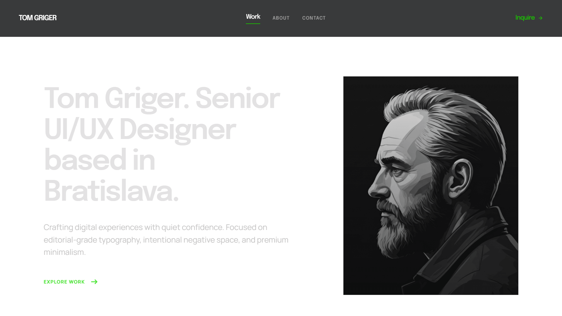
Designing in Code: How Claude Built My Portfolio
UI/UX isn't locked inside Figma — it's design judgment applied to reality. With zero prior coding experience, I used AI to bridge the chasm between blueprint and deployment, shipping this multi-page portfolio as a final, live product rather than a design handoff.

The Brief
A portfolio shouldn’t just showcase past work; it should prove a designer’s current capabilities. This case study shows how I take a real product from idea to live build end to end — not a static handoff.
Trading Prototypes for Reality
- The Portfolio Paradox: Designers build live products but ship static PDFs or Figma prototypes due to the “coding hurdle.” For my 2026 redesign, I rejected the safe route.
- Rejecting the Template: I intentionally ruled out WordPress and generic website builders. A designer’s portfolio must be a unique extension of their craft, not a cookie-cutter template.
- The Project Goal: Treat this portfolio as a real product launch — directing the front-end build myself to claim complete creative control over the live code.
The “One-Prompt” Illusion
The hype says you can ship a finished site from a single sentence. Before committing to any process, I wanted to pressure-test that claim — so I deliberately handed Google Stitch the most generic prompt I could write, stripped of the direction I’d normally bring, just to see what AI would make of it:
"Build a single-page personal portfolio website for Tom Griger, a UI/UX Designer based in Bratislava, Slovakia. The aesthetic should feel modern, dark, refined, and quietly confident — the kind of site a senior product designer would ship."
No information hierarchy, no structural logic, no defined audience — the fundamentals I’d normally lock down first, left out on purpose. The experiment was simple: could a vague brief alone carry the tool to a usable result?
No miracle. Garbage in, garbage out: the result was AI slop — a chaotic, broken layout wrapped in generic, placeholder copy. Stitch generated functional code in seconds; it just couldn’t generate the direction I’d withheld.
The Mindset Shift
- The Realization: AI is an engine, not a shortcut. A “magic wand” still requires a map. To guide it effectively, I had to stop raw prompting and return to the core framework of my career: Empathize, Define, Ideate, Prototype, and Test.
- The Strategy: I reframed the site as a conversion funnel for a highly specific, time-starved user: the hiring manager. The objective: use Progressive Disclosure to serve data logically as they scroll.
With the strategy validated, the execution began.
The Operating Model
AI absorbs the mechanical execution, which lets me focus entirely on strategy. The user journey isn’t a side-effect of the build — it is the design.
The collaboration setup is part of that strategy. Production work uses cross-checks across models, so nothing ships on a single AI’s judgment:
| Tool | Role on This Build |
|---|---|
| Claude Code | Primary execution. File ownership, builds, debugging, refactors. |
| Gemini | Independent verification. Cross-checks decisions from a different model’s perspective. |
My execution loop with Claude Code is short: I describe intent → AI proposes → I review against design taste → iterate.
The UX Layout
The strategy was set, but the AI still needed an explicit blueprint. To turn progressive disclosure into a functional interface, I mapped out a 4-tier funnel based on the hiring manager’s priorities:
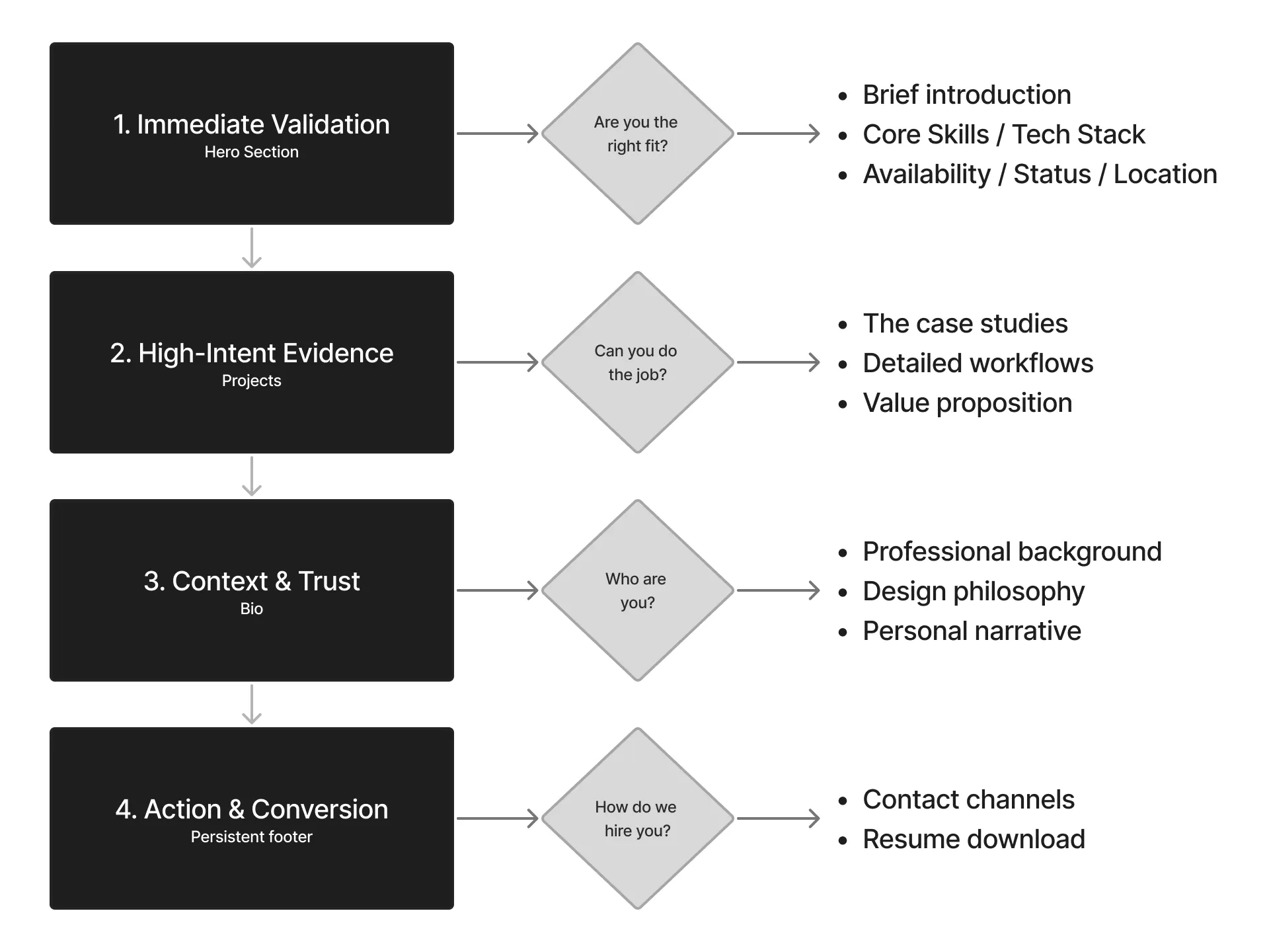
- Tier 1: Immediate Validation (Above the Fold) — Answers the most critical hiring questions instantly: who I am, my core competencies, and my live availability.
- Tier 2: High-Intent Evidence (The Project Grid) — Proves my value proposition with deep-dive project cards focusing on transparent workflows and real outcomes.
- Tier 3: Context & Trust (The Bio) — Humanizes the data, detailing my professional background and design philosophy.
- Tier 4: Action & Conversion (The Persistent Footer) — Provides a clean off-ramp with direct contact channels and an immediate resume download.
The UI Direction
The interface translates strategy into a minimalist layout built for instant scannability — purposeful whitespace, sharp typography, structured grids. Subtle micro-interactions, a multi-page structure that gives each case study room to breathe, and system-aware dark/light mode that respects the user’s OS preference.
UI execution lives deeper than surface aesthetics. Below the surface are the moments where design judgment earned its keep:
Directing the eye, not the markup. I don’t hand the AI CSS — I hand it a hierarchy decision and let it propose the implementation. This single prompt reshaped the top of every case-study page:
"Make the 'Back to projects' button at the top of the /projects pages less prominent to allow the Kicker ('Case Study') and the H1 Title to command the visual hierarchy."
The real move is restraint — demoting the right element so the page leads with what matters, expressed as intent rather than implementation.
Designing for the device that lies about itself. A hover-to-zoom affordance on project images quietly disappeared on 2-in-1 touch laptops: their hover media queries report no hover input, so the cue never rendered for users who do have a mouse. The fix detects a real mouse pointer and flags <html> for the CSS hover rule — touch and pen never qualify:
const flagMouse = (e) => {
  if (e.pointerType !== 'mouse') return;            // touch & pen never qualify
  document.documentElement.classList.add('has-mouse');
  window.removeEventListener('pointerover', flagMouse);
};
window.addEventListener('pointerover', flagMouse);
Hover media queries misreport on hybrid laptops, so the affordance silently vanished — detecting a real mouse is the inclusive fix, found only by testing on the actual device.
What’s Live
This portfolio isn’t a description of the work — it is the work. Everything here shipped to production:
- Multi-page site — statically generated, each case study on its own route.
- System-aware dark/light mode — the right theme paints before first render, honoring the OS preference with a persisted user override. No flash.
- Purposeful motion — a staggered hero reveal and scroll-triggered section reveals, gated behind
prefers-reduced-motion. - Built-in wayfinding — a sticky scroll-spy contents rail and image lightboxes with keyboard navigation and focus return.
- Accessible by default — WCAG-AA contrast, visible focus states, and comfortable tap targets.
Shipping Was the Experiment
A portfolio is a product, and its only job is conversion — turning a hiring manager’s scarce attention into a reply. So the day this site went live, I instrumented it with Microsoft Clarity and watched how real visitors moved through it. Then I applied to a batch of roles and read the sessions.
The data was blunt:
- The case studies weren’t being read. A few visitors clicked in to scan and confirm the work was real — but nobody deep-dived. (Including this one — if you’re still reading, you’re the exception.)
- The home page carried everything. That’s where visitors stayed and scrolled — about 70% scroll depth and roughly 37 seconds of active time before they moved on.
I’d built the site assuming recruiters would explore it the way I would. They don’t. The honest read: I had about 37 seconds, on the home page, to land the entire pitch. So I made two changes and shipped them:
- A sharper hero. I reworked the top of the page to deliver a faster, clearer overview — who I am, the value I bring, and proof I ship — in the first seconds, before anyone decides whether to keep scrolling.
- A new “Strengths” section, right beneath it. The most important things I do and how I actually work — surfaced on the home page itself, so the core of my value lands without requiring a click into a case study.
I didn’t water down the case studies; this deep dive is still here for anyone who wants the evidence. I just stopped relying on them to make the first impression and let the home page carry it.
That loop — ship, measure real behavior, iterate — is the part I’d bring to a product team. Clarity is still running, and Vercel Analytics is going in next to watch conversions more closely.
The Takeaway
Building this portfolio proved that while AI democratizes code execution, it vastly amplifies the value of senior product thinking. The tools handled the mechanical syntax, but the critical decisions required human judgment.
Here is what it actually means to design in the AI era:
- AI is an engine, not a map: “One-prompt magic” is a myth that yields generic slop. To get production-grade results, you have to guide the tool with a rigorous UX framework, clear information hierarchy, and real intent.
- When code is cheap, taste is the differentiator: When anyone can generate layouts in seconds, the ultimate value shifts entirely to aesthetic restraint and user empathy. Knowing what to amplify, what to demote, and how to direct the user’s eye remains an exclusively human skill.
- True UX lives in real-world edge cases: An AI won’t inherently catch how a hover animation silently breaks on a hybrid 2-in-1 touchscreen laptop, or how a theme flash disrupts a user’s dark-mode preference. Good design means owning the final product quality across actual hardware.
The ultimate lesson: AI doesn’t replace the designer — it amplifies one. By handling the mechanical execution, it freed me to focus on what matters most: product strategy, creative taste, and an accessible, well-built user experience.
For a team, that’s the practical upside: I move from idea to working build fast, I catch the real-world edge cases most handoffs miss — devices, accessibility, theme state — and a polished, accessible result reaches users without waiting on a separate front-end pass.
More projects
Friction to Feedback: Designing a B2B2C Reputation Engine
Handed a one-line brief, I redesigned a partner's outdated questionnaire into a 1-click email rating that routes happy users to public reviews and unhappy ones to private recovery. A proposal — and my deepest product-thinking piece.
Balancing Business Margins and User Experience
A self-directed concept: turning a one-button margin fix into location-aware routing that balances cost, ethics, and UX at once — built from a real DNA ERA constraint.