Case Study
Balancing Business Margins and User Experience
When DNA ERA expanded to Romania, rural customers couldn't reach drop-off points. My actual task was small — design a low-prominence courier option to protect margin. This case study is what I explored beyond it: a self-directed concept for location-aware routing that protects margin without abandoning a single customer. Concept work, not shipped.

The Context & Friction
DNA ERA kits rely on a strict linear flow: kit delivered → user collects sample → user returns it via a pre-paid label → results delivered in-app. In established markets, this is frictionless due to high drop-off density.
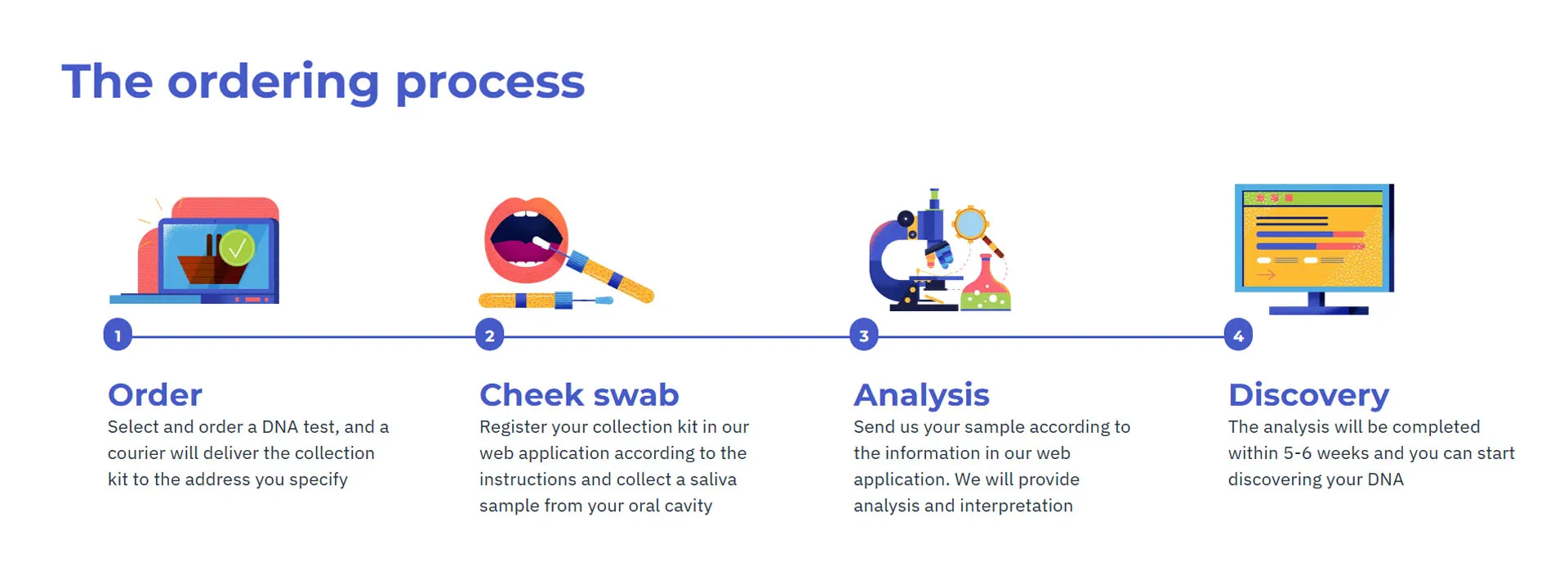
Romania broke this model. The local carrier (Cargo) lacked rural parcel lockers. For underserved customers, the nearest drop-off could be 20+ km away, rendering the product effectively broken post-purchase.
Scope, stated plainly: my PM had already chosen the business answer — a least-prominent secondary button or text link for courier, to avoid the 5× cost. My brief was that one element. I used it as a springboard to solve the whole problem as a product designer would. Everything below is my self-directed concept.
We weighed three sub-optimal business choices:
- Courier for everyone: Protects UX, but the 5× cost kills the product margin.
- Drop-off only — let edge users figure it out: Maximizes margin, but abandons rural customers who already paid.
- Hide courier behind small print: Protects margin via friction, but destroys user trust.
The Challenge: How do we protect business margins while ensuring an ethical, seamless return path for 100% of our customers?
Refactoring the Stepper: Designing for Systemic Change
While transforming the tracking stepper looks like a visual cleanup, it acts as a high-intent entry point. The new UI collects the user’s location data to initiate the adaptive routing logic layout.
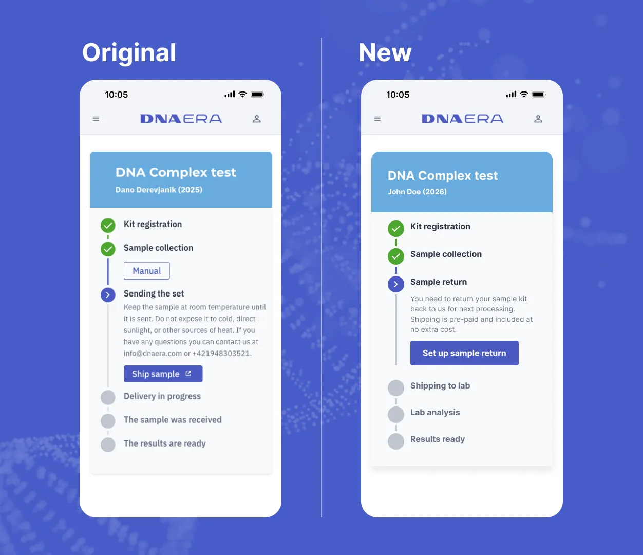
Invisible UX: Identical UI, entirely different logic. We intentionally preserved the visual system to avoid user friction, while designing the tracker to behave like an active gateway rather than a passive status list. The backend to support this would be engineering’s build — I designed the experience and the logic it needs to serve.
- Action-Oriented Language: Renamed “Sending the set” (passive) to “Sample return” (active). Aligning with standard e-commerce mental models eliminates ambiguity and sets a clear expectation for the next action.
- Value-First Copy: Replaced a dense block of technical temperature rules and support links with a clear value proposition: “Shipping is pre-paid and included.” Technical specs were moved to the physical box, minimizing cognitive fatigue at the digital decision point.
- Native UI Components: Transformed an external link style (“Ship sample →”) into a prominent native button (“Set up sample return”). The new native CTA preserves context and establishes a secure internal entry point that handles the user’s location data seamlessly.
- Decluttering Completed States: Removed the legacy “Manual” link from the completed Sample collection step. Clearing secondary entry points from past milestones guides the user’s eye down a clean, uninterrupted vertical path.
- System Status Transparency: Updated passive tracking milestones (e.g., “Sample received”) to forward-looking nouns like “Lab analysis.” Clearly communicating the invisible processing stage sets accurate expectations, proactively reducing anxious customer support tickets.
Handling the Wait: Designing a Seamless Loading State
Clicking “Set up sample return” triggers an instantaneous background check. To keep users informed while the system queries local drop-off density in the background, we introduced a minimalist interstitial loading state. This manages user expectations and prevents layout shifts while the engine calculates local drop-off density.
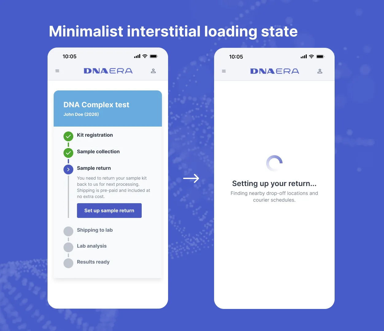
Latency Management: A clean, behavioral loading transition that keeps the user informed and prevents cognitive drop-off during live backend database queries.
The Solution: Address-Aware Routing
The system silently verifies whether at least one partner drop-off exists within a 5 km radius of the shipping address before rendering the final layout. To balance economics and ethics, the UI adapts dynamically based on that real-time check:
| Condition | Default Pre-selection | UI Treatment & Rationale |
|---|---|---|
| ≥ 1 drop-off within 5 km | Drop-off Network | Displays a “Recommended” badge; centers the map on nearby lockers. Encourages the cost-effective path via proximity evidence. |
| 0 drop-offs within 5 km | Courier Pickup | No recommendation badge displayed. Minimizes map interaction and hides density badges to eliminate cognitive noise, transitioning directly to a scheduled pickup sequence. |
Dynamic Flow Execution
PATH A: Dense Area (Local Drop-off Available)
When the system detects accessible drop-off points, it defaults to the cost-effective partner network, displaying the locations clearly on an interactive map view.
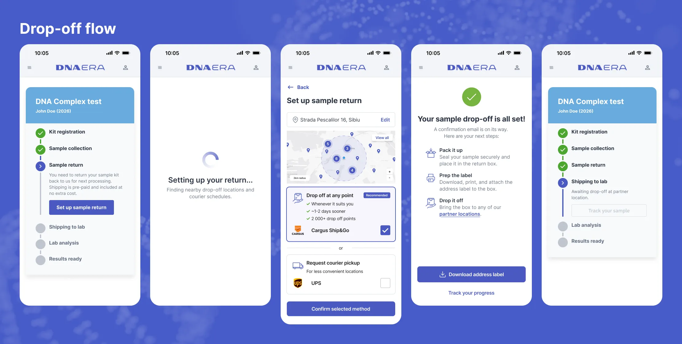
Path A End-to-End Flow: Triggered for users near a package hub. Includes the adaptive address review, selection confirmation, dynamic packaging checklists, and tracking integration updates.
PATH B: Rural Area (Remote / Courier Required)
For rural areas with zero verified hubs, the layout automatically bypasses the map component to reduce friction, presenting an integrated courier scheduler directly in the view layer.
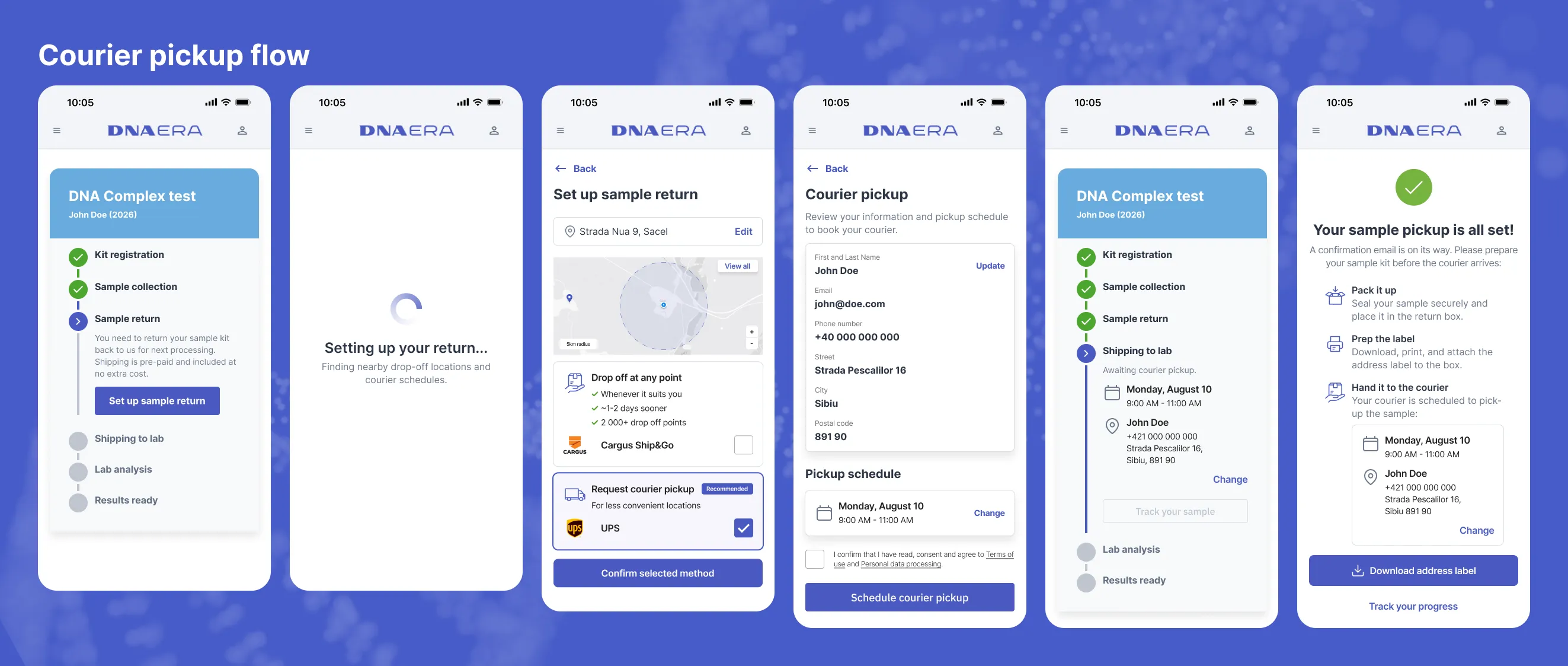
Path B End-to-End Flow: Triggered for rural users. Renders an in-context schedule picker and symmetrical confirmation layouts, so rural users get a clear, low-effort path that handles the logistics for them.
Reducing Navigation Fatigue During Courier Scheduling
When a user selects or defaults to a courier pickup, modifying registration details or selecting alternate timeslots should not derail them or break the parent flow. To eliminate navigation fatigue, all data updates are handled inside contextual modal layers and slide-up sheets.
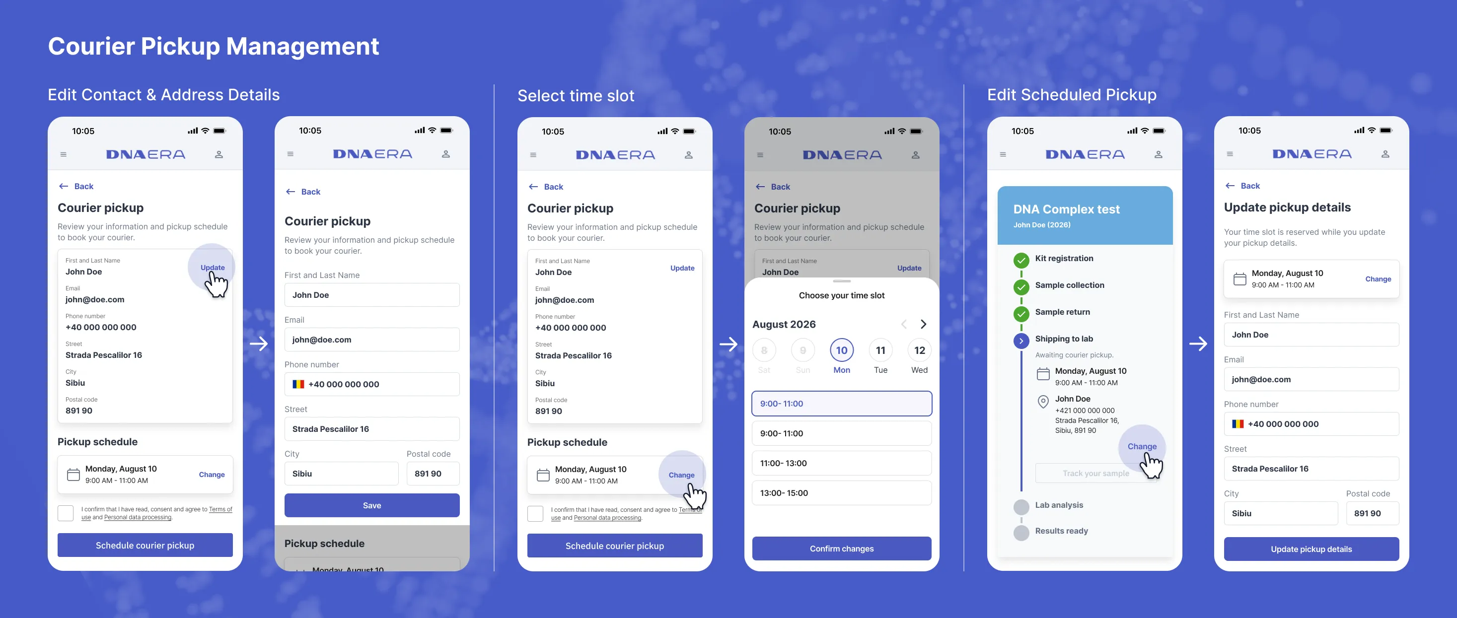
State Management & Data Mutation: A 3-part micro-interaction flow mapping how user inputs dynamically modify scheduling logic while preserving app context.
- Edit Contact & Address Details: Clicking “Update” reveals text input focus states immediately inline. If a user alters their destination address, saving the form instantly re-runs the background radius check in real-time, validating if a physical drop-off locker is now viable.
- Select Time Slot: Triggering a time-slot change summons a native bottom sheet overlay. This keeps the parent overview alive in the background while securing a temporary server-side reservation lock on that specific courier pickup slot.
- Edit Scheduled Pickup: Once confirmed, the parent tracking layout updates to show the pending schedule instantly. If details require post-confirmation adjustments, the layout dynamically branches to an “Update pickup details” transactional state without forcing an entirely new checkout cycle.
Core Architecture Pillars Maintained:
- Adaptive, Not Forced: Both options remain visible side-by-side at all times. The courier option is transparently labeled “For less convenient locations.” The user is never locked in; the default serves as an intelligent guide, not a cage.
- Context Preservation: Editing an address triggers an instant re-check of the radius. To keep the flow seamless, the courier time-slot picker operates within a contextual sheet rather than forcing a page redirect.
Guardrails & Success Metrics
Because this is a concept, there’s no live data. Here are the guardrails I’d set and how I’d measure them:
- Growth & Coverage: The return-completion rate among rural users (fixing the original broken loop).
- Margin Discipline: Keeping courier pickups under ~15% in well-served (dense drop-off) areas to protect unit economics.
- Experience Quality: Tracking CSAT specifically for courier-pickup users to ensure the underserved cohort receives a premium experience.
There’s no production data — this is a concept. The bet: a “Recommended” badge plus proximity evidence guides most dense-area users to the cheaper drop-off path without ever restricting choice. To validate it for real, I’d A/B test a 3 km vs. 5 km radius to find the point that holds courier share near ~15% without hurting completion. Until that data exists, the 15% is a target, not a result.
More projects
Friction to Feedback: Designing a B2B2C Reputation Engine
Handed a one-line brief, I redesigned a partner's outdated questionnaire into a 1-click email rating that routes happy users to public reviews and unhappy ones to private recovery. A proposal — and my deepest product-thinking piece.

Designing in Code: How Claude Built My Portfolio
I'm a UI/UX designer, not a developer. So I directed AI through every component, animation, and interaction — shipping this multi-page portfolio as my own production product.